How The Present Was Built
“Unequal Growth” describes the emergence of China, the growing economic irrelevance of Europe & Japan, and American dominance, using 30 years of public data provided by the World Bank.
This essay began with one observation: In the first decade of the 2000s, the top 2 nations generated 31% of all the Economic Growth. In the next decade, their share double to 60% of Global Economic Growth. Growth is now a 2-player game.
click to embiggen — left pie chart is 1999-2008, right pie chart is 2009-2018, to reflect the most recent publicly available data
Readers whose preferred economic mental models are Zero-Sum, will implicitly translate the verb “generated” to “Captured”. Readers who default to Positive-Sum models will instead translate it to “Created”. They’d both be right.
What I hope to highlight is that the Zero-Sum folks and the Positive-Sum folks both rely on incomplete models. Despite first appearances, the two models are not mutually exclusive. When there’s no Growth at all in a system, Zero-Sum strategies are readily apparent.
But the largest payoffs for Zero-Sum strategies come when they change the beneficiaries of future Positive-Sum Global Growth periods. Which is to say: when Creation and Capture go together.
“Unequal Growth” — a summary:
You can sum the GDP of every country in the world to measure “Global GDP”
This tells us when the “whole pie” is growing — “Positive-Sum” — and gives an indicator of the Global macro economic environment
The World Bank’s public data set goes back through 1988, giving us a 30-year window into Global economic health
Graphing Global GDP shows 4 distinct periods of Growth, and 4 periods of Contraction — each with their own story of winners and losers:
I’m counting 1998 & 2001 as 2 back-to-back Contractions
1990-1996: United States of Japan (Growth)
USA & Japan drive/capture 44% of Global GDP increases
Germany and China earn honorable mentions as Industrial exporter nations
Rest of the world is a rounding error & seemingly irrelevant to Global Growth
1997-1998: China Wins the Industrial War, Upends Existing World Order, Financial Chaos Ensues (Contraction)
China’s Industrial machine kicks into gear, taking huge market share from other exporter nations (i.e. all of Asia and Germany)
Asian economies explode in financial crises when their expected growth fails to materialize
US completely unaffected, growth continues
1999-2001: Unrealized Growth Expectations (Contraction)
Japan’s struggle continues, nobody buys their products with cheaper Chinese goods on the scene & their GDP shrinks by $600B
Rocky Euro launch + Chinese competition stymie Germany, their GDP shrinks by $250B
USA & China both grow enough to offset these losses
2002-2008: World Unites, Sings Kumbaya Round Campfire (Growth)
The greatest period of Global growth is also the most egalitarian — no single nation accounts for more than 14% of Global growth, prosperity flows to everyone
The rich get rich, and the poor get richer
2009: If We Go Down, Then We Go Down Together (Contraction)
Egalitarian Growth necessitates egalitarian Contraction, and the whole world explodes as the Campfire becomes a Mortgage-Backed-Security bomb
2010-2014: A Depressing Return to Growth Inequality (Growth)
52% of Global Growth driven by USA and China
No other nation contributes more than 4.5% of the increase in Global GDP
To call it a “Growth” period overstates what happens to non-US, non-China nations
2015: The Global Economic Apocalypse Nobody Remembers (Contraction)
Largest Global contraction on record, with the only period of negative 3-year Growth in the dataset
130/186 nations experience significant decrease in their GDP. All of Europe, Asia, Africa, & the Middle East
Americans completely unaware of the widespread economic havoc that happened…
…because the US & China together grew by over a trillion dollars
2016-2018: Locking in the Two-Player Game (Growth)
Distribution of Growth stabilizes, US & China get 45% of Global Growth, no other nation gets more than 5%
Cumulative Result:
There are 2 kinds of Growth Period: “stable” and “unstable”
During stable periods, Growth correlates with Size — large economies grow a lot and small economies grow a little, such that the relative ranking of nations by GDP remains “stable”
During unstable periods, that correlation breaks down as Growth share is captured and the player rankings reordered
If you’re not Capturing any of the Growth Created in a Growth period, the total pie can grow while your slice stays the same size:
$ are in Billions of constant-2018 USD. I made this by summing the GDP of every nation in the WorldBank data set (~180 countries).
Intro: Is the World Greater than the Sum of its Parts?
Most international comparisons simply take one Nation they care about and compare it to another, usually picking whichever other nation happens to highlight the specific policies they’re advocating. “Sophisticated” studies will consider a self-selected basket of nations, but the point is the same. I.e. sophistry instead of analysis.
Consider them all, or none at all!
So: consider the entire planet. Each nation buys, sells, creates, invests, & consumes as it pleases. The result is their Gross Domestic Product (GDP).
You can sum the GDP of every nation and get the total economic product of the entire planet. Global GDP, or “Gross World Product”.
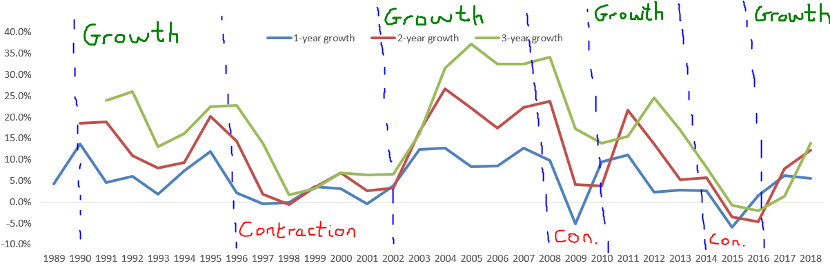
Here’s Earth’s GDP from 1988 - 2018 (30 years)
click to embiggen -- I included year-over-year growth, as well as 2-year and 3-year growth to show longer-term trends
Our little planet increased its GDP from $19 Trillion to $84 Trillion over the last 20 years, an increase of $65 Trillion (+343%). That’s some serious Growth.
Score:
Earth: $65 Trillion
Mars: 0
Go team Earth!
What I want to do here is explore the context behind this Global Growth, without picking and choosing nations arbitrarily. To understand what it means to Create $65 Trillion over 30 years. And to understand who was able to Capture that growth.
By my estimation there appear to be 4 periods of Growth and 4 periods of Contraction in the World Bank’s records:
I’m going to chop this graph up and discuss each period of Growth and Contraction in the micro. I’ll try to swap hats between the Positive-Sum and Zero-Sum perspectives too, with the hope of demonstrating that neither is ever entirely wrong.
Many people are familiar with a single period in recent history and instinctively extrapolate that one period’s Growth dynamics to the past, present, and future. But like the twinned eyepieces of binoculars, the image is best understood with the depth & nuance that comes from two perspectives. I’ll throw this telescope emoji in occasionally to highlight when I’m only considering one perspective: 🔭
1990-1996: The United States of Japan (Growth)
The chart on the left is total GDP in 1996 for the 20 largest economies. The chart on the right is how much each nation grew over the prior 6 years. So that big blue slice of pie on the right-hand chart tells us the USA added $2.1 Trillion to its GDP between 1990 & 1996.
You can clearly see on the right that the United States & Japan account for the majority of global growth in this time period. If I include all 182 nations, the United States & Japan are together responsible for 44% of Global Growth.
That’s pretty wild.
Germany & China together account for another 15% of the increase in global GDP. Brazil, France, the United Kingdom, and Korea are combined responsible for another 15%.
Those 8 countries drove 75% of the increase in Global GDP:

The other 174 countries are quite literally rounding errors
There’s enough material in this period alone to write a whole book about, but in doing so we might lose the forest for the trees.
To sketch a quick narrative for the top 4:
- The United States continues its
manifest destinyunstoppable growth - Japan fuels its internal consumption-driven growth engine by running a trade surplus with the USA & the rest of Asia:
- Post-reunification Germany begins to reallocate European Industrial activity to within its borders, as described here
- Some light switches have just flipped on in China, labeled “Industrialism” and “okay maybe markets can be useful”
Note that Japan, Germany, & China all operate forms of Industrialism during this period: their large trade surpluses help fuel domestic consumption and create Global Growth.
One response to this picture is to suggest that the nations who added the most to Global GDP are simply the nations with the largest economies. If the whole world grows equally by 10%, then anyone who started at $10B GDP will grow 10x more than anyone who started at $1B. You can graph the increase in national GDP during a Growth period vs. the size of each nation and clearly see this relationship:

Zero adjustments made to this data and an R2 of 0.95! This data includes all 182 countries (except Iraq, for whom no data is available), and gives us an unbelievably good fit on the linear regression.
Positive-Sum people will take heart in the above chart. The Unequal Growth from 1990-1996 is scary, but perhaps it’s just an artifact of differences in scale? 🔭 However there’s a question about which number to use for the X-axis here — 1990 GDP (the starting point) or 1996 GDP (the ending point)? Does Scale lead to Growth, or is it the Growth that creates Scale?
When we switch to using the starting point for this Growth Period, the relationship gets slightly worse (though an R2 of 0.90 is still incredible for raw data & hard to argue with!):

The Zero-Sum folks only response to these two charts is: “yes, Scale correlates with Growth, but mostly because Scale today is a product of Growth yesterday and you should be careful about mistaking correlation for causation. At some point in the recent past, Japan was NOT the 2nd largest economy in the world — and whatever they did to achieve that outcome is still driving their Growth today.” 🔭
It’s a good point. But still. The Zero-Sum folks have to concede that both of these simple linear regression trendlines fit the data incredibly well. The raw data suggests a decent relationship between Scale and Growth. A vague: “maybe it’s not causal?” is the best the Zero-Sum perspective can counter with.
1997-1998: China Wins the Industrial War, Upends Existing World Order, Financial Chaos Ensues (Contraction)
Nothing good lasts forever.
Global GDP shrank by $129 Billion in 1997, and then another $44B in 1998. What went wrong?
See for yourself:

yes, that is an impressive $800 Billion decline in Japan’s GDP
Interestingly this also looks a lot like a list of Industrial exporter nations.
Japan’s economy shrank by ~20%. Ouch. Between Japan and Korea over $1 Trillion of Global GDP went up in flames. You can read more about the “1997 Asian Financial Crisis” on Wikipedia.
But I want to make clear this is not a “financial” crisis analysis — it’s a Production analysis.
Together, Japan, Germany, & Korea reduced Global GDP by $1.3 Trillion — about 5%. And yet. Global GDP only shrank by $173 Billion during this period. That’s a difference of over a trillion bucks. Which means some players must have grown enough to offset their ~trillion-dollars of lost production.
Who gained while the whole world shrank? 🔭

The Official #1 Grower, the US economy grew at exactly the same pace it had been growing at previously. There’s nothing Zero-Sum about US growth — it’s just unstoppable. The rest of the world’s economies blowing up was offset by half simply with American business-as-usual. As far as America was concerned, there was no global contraction. Grab a Big Mac & hop in, kid, the Dow’s going to 7,000!

Industrial goods are on sale!
At #2, the UK offset about 10% of the ‘97-’98 Global Contraction. The economies of the UK and Germany behave inversely to each other in this time period. When times are good and capital is plentiful, German production outcompetes all of Europe. London’s economy grows as its capital allocation ability fuels that process, but its growth is secondary. However, when times are hard London’s financial stability dominates the continent, as Capital can be moved away from underperforming areas more easily than factories.
Which brings us to China: the “1997 Asian Financial Crisis” sparked a reordering of Asian economies from which China emerged victorious. That’s not controversial, you can read it in the Wikipedia summary.
The controversial part is that the causality can equally-well be reversed:
China’s post-1980s industrial reforms had just begun to take China’s GDP exponential by 1996, precipitating — necessitating — a radical & fatal restructuring of the global hierarchy of Industrial Exporter economies:

re-using this image from an earlier essay to highlight the apparent inflection in China’s growth curve precipitates the 1997 crisis
The fact that the major Anglosphere economies — US & UK — are running a Financialism playbook and have national economies dominated by their respective financial markets — NYC & London — means that English-language commentary understands all crises as financial crises first and foremost.
But, despite our commentary, not all economic tragedy begins in the financial markets.
The supposed origin of the 1997 financial crisis, after all, was the inability all across Asia to maintain currency pegs vs. the US dollar. The outcome of the financial crisis was a shocking devaluation of Asian currencies:

Readers of The Germany Shock will understand that “The Currency Problem” is the terrifying cancer at the heart of all Industrialist nations. The more people buy your products → the more demand there is for your currency → the more expensive your currency becomes → the more expensive your products become → the fewer people can afford to buy your products → "shit.”
But what if nobody is buying your products? Just invert that chain all the way down. Nobody wants your currency → It becomes cheaper → Your currency devalues…
The immediate outcome of the 1997 Asian financial crisis was that Asian currencies could not sustain their pegs and organically devalued — and everyone blamed currency speculators because they got rich in public, or the Ministry of Finance because, well, it’s in their name! But the job of the speculator is to uncover market inefficiencies, not create them. Just like when Soros broke the Bank of England for the sin of trying to lie about the value of their economy, all those Asian currency pegs were lies.
The lie: people want to buy our products.
All financial values are based on expected future value, from businesses to currencies. This financial crisis was the result of unwinding expected values that failed to materialize due to unforeseen competition. It’s not that the future value itself was a lie, it just was not to be found in Thai, Indonesian, Korean, or Japanese economies.
That’s the Narrative, now look at the data & see for yourself:
The year is 1996, 1 year before the crisis. The United States is the only nation on Earth whose growth is preordained. Everyone in Asia has their currency pegged to the dollar to encourage exports to America and stave off “The Currency Problem”.
Their currencies are all priced under the assumption that their domestic economies will move in the same direction as the US’s and US businesses & consumers will buy their products.
And now look at the year-over-year growth of their actual exports to the USA:
Pictured: a decent year, pre-crisis, according to Global GDP. “Other Asia, nes” refers almost entirely to Taiwan, which the World Bank is disallowed from naming directly due to the intersection of small politics and big egos
Again, this is pre-crisis.
Total US imports grew 6% in 1996 — red dotted line. But Japan and Korea saw their “share” get obliterated, and other smaller Asian nations saw less than 3% growth. Anyone below that red dotted line is growing slower than the market — i.e. losing from the Zero-Sum perspective 🔭
As you can see below, US imports as a fraction of US GDP grew steadily and consistently from 1991-2000:
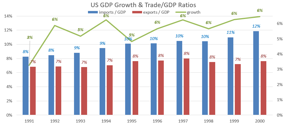
Point being: the US buys more stuff than ever before from other nations (blue bar), both in absolute terms and as a percentage of its GDP
…and yet Japan and Korea saw decreasing (!) exports to the USA from 1995 - 1998:

It’s hard to notice, seems like such a small thing really, but this is what the beginning of Industrial irrelevance looks like. Market leaders throughout history have failed to notice such small blips before, usually right before their fall.
— i.e. losing from the Positive-Sum perspective 🔭
The financial crisis comes after the Industrial world order gets upended.
If your exports to the US aren’t growing 5-6% every year, you’re losing market share and you can expect to see your currency devalue and your industrial companies lose value as a result. Your domestic consumers will now have less money to spend on their own personal consumption, and your currency devaluation means they can’t afford foreign goods anymore either.
If the dollar value of your exports to the US actually shrinks from one year to the next, you’ve already lost on all fronts and I suggest you start doubling down on your financial services sector and hope you can shift your economy into one that grows by efficiently allocating Capital. Hopefully your next-door-neighbors like you enough to allow your banks & private equity firms to invest in their countries?

Shoutout SoftBank
There were 138 nations who increased their exports to the USA over this 4 year time period, but the lion’s share of those increases went to just 3: Mexico, Canada, & China.

America spent its Globe-dominating growth buying a lot more from Mexico, Canada, & China, a little more from Europe, and a lot less from Japan & Korea.
Zero-Sum zealots lean forward in their seats and say “I told you so!” Positive-Sum people chalk it up to one-time extenuating circumstances, easily explained once you properly contextualize the data. Something something NAFTA…
Before we can get back to Growth, though, we’ve got another Contraction to deal with — a “double-dip” special:
1999-2001: Unrealized Growth Expectations (Contraction)

Sadly the 2000s begin with a contraction period, with a Global recession in 2001. Global GDP shrank by $162B and as before, I must ask: who’s to blame?
![A note on the data in this table: [0]](https://images.squarespace-cdn.com/content/v1/5a571a7d80bd5e91de77e8e6/1592948501702-8YOYYF2T9LOQCB9FWR2J/contraction_table_2_conractors.png)
A note on the data in this table: [0]
The total magnitude of GDP decrease experienced by these 8 nations is ~$1.3 Trillion.
A familiar story by now, with some familiar faces leading the charge of this Global recession.
Japan is obviously the primary driver of the Global GDP decrease, with Germany as a significant secondary driver. You can read more about the early 2000s recession on Wikipedia here:


As before, Anglosphere conventions frame all economic problems as primarily financial problems. In this case: “deflation”.
And as before, “deflation” is not an act of God — it’s a market signal about the value of your entire economy. In this case, the signal says: “people don’t want to buy your products as much as they used to.”

The Positive-Sum view notes that if you step back far enough, things as-a-whole trend upwards. 🔭 The Zero-Sum view agrees — but notes that if you look closely, there’s not a single year where all 4 nations grew as much as the market. In every year you can spot a clear “loser”. 🔭
Japan’s core problem was everyone stopped buying their products. Implied in that statement is the prior expectation that everyone would in fact continue to buy Japanese products.
If Global GDP only shrank by $164B in 2001, that again means some nations must have grown enough to offset the aforementioned ~trillion dollar decreases. In these years we can take United States growth for granted — the US is basically an unstoppable GDP-generating machine — which leaves:

The picture, then, is a Japan- & Germany-driven recession offset by the USA, China, & Mexico — a continuation of the contraction story from 1997-1998.
The Zero-Sum narratives are clearest during periods of Global contraction, when it’s easy to differentiate between winners and losers.
Don’t think I’m dismissing or unfamiliar with the Financial Explanations for Japan’s economic woes. From the fringe “Princes of the Yen” documentary with its “everything is the fault of central bankers” narrative, to the more mainstream takes from Scott Sumner (1, 2, 3) and Paul Krugman (“Japan’s Trap”, 1998, & “Rethinking Japan”, 2015). Krugman’s ‘98 paper in particular is great, and concludes:
Japan is an economy that is almost certainly producing well below its productive capacity - that is, the immediate problem facing Japan is one of demand, not supply. And it gives every appearance of being in a liquidity trap - that is, conventional monetary policy appears to have been pushed to its limits, yet the economy remains depressed. What can be done? There seem to be three main answers: structural reform, fiscal expansion, and unconventional monetary policy. Let us consider each in turn.
And yet there is no mention of the fact that Japan’s nearest neighbour had just begun unprecedented economic reforms, transforming a broken communist system into an industrial-exporting vertically-integrated market-oriented-but-state-directed quasi-capitalist state the likes of which the world had never seen before.
Japan’s “Lost Decade” begins in 1991. That year the US imported ~$20B worth of goods from China and ~$100B from Japan. Just 11 years later, in 2002, the US imported $134B worth of goods from China and a mere $125B from Japan. China grew their exports by more than the amount that Japan began the decade with. “Lost” decade? Maybe.
Forgive my economic heresy, but I dare to consider a heterodox idea about where Japan’s expected Growth went…

Is it an accepted position that US imports as a % of GDP would have shrunk for the first time ever if Chinese imports were not available? Or is it perhaps reasonable to view the competition for US dollars as approximating a Zero-Sum game? 🔭
When Walmart opens a supercenter out in the boonies and puts Mom & Pop stores in a 50 mile radius out of business, Mom & Pop might lobby for reduced minimum wages to help them compete on price (~Structural reform), or negotiate for local-government-supported interest rates on their SMB loans (~Monetary policy). But everyone acknowledges that the goal is to improve their ability to compete vs. Walmart.
And yet in Japan’s case the rapid emergence of a regional economic superpower in their backyard seems to be an example of What You Can’t Say.
Why does that matter? Because solutions rarely succeed when they misdiagnose the problem. Acknowledging that Japan’s problems begin with Zero-Sum competitiveness would lead us to look at different categories of solutions and to consider other impact factors:


That’s over a decade of trade-war tariffs from Japan’s largest customer, across 3 administrations & 2 political parties. Motorcycles, computer-components, TVs, and cars. What did Japan make again?
The 100 percent tariff on computer chips from Japan coincidentally happens the exact same year that TSMC is started in Taiwan — “Other Asia, nes” — and that final picture, dated 1995 and signed by President Clinton, comes 2 years after Clinton united with Republicans to push NAFTA through Congress and 1 year after he granted China Most-Favored-Nation trading status:

No comment on the human rights stuff… source
It should be clear that there was a sizable anti-Japan politico-business sentiment from the mid-80s onwards, which culminated in a one-sided trade war. The expectation of the Tariffs applied was the usual rhetoric about supporting domestic United States businesses. The reality was that they merely helped reallocate US import dollars to other non-Tarriff’d nations.

This meme is of course the naive position, which assumes the surprise at Japan’s difficulties is genuine, and that nobody in the administration noticed the timing of implementing trade barriers on one partner and trade accelerants on others
Japan’s struggles make it hard for me to rely on the Positive-Sum perspective here, and the only way I can think of a Positive-Sum case for what happened is to backdoor Financial Policy in as the cause of Japanese woes. If Japan’s problems were solely the fault of Central Bankers & the Ministry of Finance mismanagement, then we could maintain the belief that this was a Positive-Sum period whose Growth opportunity was simply flubbed by Japanese mismanagement. 🔭
But in this case I find the Zero-Sum evidence stacks high indeed.
Nonetheless, we might think of this double-dip recessionary period from 1997-2001 as the “cost” of restructuring the Global Industrial Exporter hierarchy, both with Japan’s “Lost Decade” and Germany’s two painful contractions — and once that cost was paid and values reset to meet new (lowered) expectations, we can strap back in for a Positive-Sum Growth!
Right?

2002-2008: World Unites, Sings Kumbaya Round Campfire (Growth)
I tried to keep every country in the same place & with the same color as Growth Period 1
If you can remember 2,000 words back to the dark ages of 1990-1996, when 45% of Global Growth was owned/created by just 2 nations (USA & Japan), you’ll immediately notice that this Growth Period is an egalitarian utopia.
Just look at that right-hand pie chart!
Global growth was $28.7 Trillion (+84%!), and this Growth was broadly distributed across the Globe:

"% of total” difference between the pie chart and the table here is because the table includes all 182 nations while the pie chart is just looking at the top 20
This table is about 70% of the total global growth, just like the table from 1990-1996, but this one includes twice as many nations as the earlier table.
Only the United States and China account for more than 10% of the Global growth. Even down-on-its-luck Japan makes it on the table (albeit in 9th place, down from 2nd).
This is an incredibly unique period!
I cannot overstate how awesome this 6-year Growth window looks.
If you’re a champion of the Positive-Sum Growth playbook, 2002-2008 seems like a return to the Platonic Ideal of everything you stand for!
However. If I look at the GDP Increase vs. Scale charts from before, 2 things jump out:
The R2 values are both significantly worse than they were in 1996 (when they were 0.90/0.95)
The gap between how well the trendline fits using pre- vs. post- data (2002 vs 2008 in this case) has increased
This is easy to see with the naked eye — China and Japan are both far from the trendline (in opposite directions).
Nonetheless, everyone except Japan and the USA lies above the trendline, which means the rich got rich, and the poor got richer. Score for the Positive-Sum crowd 🔭
2009: If We Go Down, Then We Go Down Together (Contraction)
Everyone knows the whole world blew up in 2009:

2009 is the only year in this whole data set — 1988 to 2018 — when United States GDP shrank:

I’m not going to re-litigate the 2008/9 financial crisis — you can read 3 books on it and still not fully understand what went wrong.
From my perspective this is the least interesting Contraction. Everything sucked, for basically everyone. This neatly mirrors the preceding Growth Period from 2002-2008 — everyone grew together, everyone blew up together.
The “offset” analysis — which nations managed to grow during this period of Global Contraction, and how much were they able to offset the Contraction — shows little of interest:

Yeah, I guess China grew a little 🔭, but even the Chinese growth engine was only able to offset 12% of the Global Contraction. And Japan’s GDP only grew in 2009 because it shrank so damn much from mid-2008 to Q1 2009 that it began the calendar year in such a low place it was able to end the calendar year a bit higher. That’s about it.
2009 sucked for everyone.
Again, the Positive-Sum worldview reigns supreme here, albeit in the wrong direction 🔭
From 2002 to 2009 the whole world moved in harmony, winning together & losing together, with smaller nations taking an outsized share of the gains. Anyone who fails to study this period might end up believing that true Positive-Sum Growth is impossible — and they’d be wrong, and poorer for it.
On the flipside, anyone who did the majority of their studying during this egalitarian period might try to generalize its lessons when they don’t always apply… 🔭
2010-2014: A Depressing Return to Growth Inequality (Growth)
Thus ends the egalitarian experiment.
2010-2014 sees the end of the broadly-distributed GDP Growth that dominated 2002-2009 and a return to “winner takes most” Growth:

Yes, China and the USA are more than 50% of the total Global GDP increase in this time period. Yes, that’s still pretty wild. And yes, Japan’s GDP shrank by $850 Billion despite a Global Growth environment.
When you expand the comparison to include all 189 nations:

rip 2002-2008 equality
Hilariously (or tragically depending on your perspective 🔭) this is more concentrated than when Japan & the United States dominated Global Growth from 1990-1996.
Many folks have written and talked and pundited about the “long, slow” recovery post-2009. But the reality manages to look bleaker still:
The US & China got a growth engine started back up. Maybe not quite as robust as 2002-2008’s, but still a decent force for productivity increases.
Everyone else is running on empty. No fuel. No Growth to speak of. Sputtering. Squabbling over scraps. The Zero-Sum spectre looms on the horizon despite the backdrop of Global Growth.
The correlation between GDP Growth and the Size of each Economy has broken down almost completely now:
click to embiggen
China and Japan are both so far from the trendline — while also driving double-digit percentage swings in the Global outcome — that the whole correlation becomes laughable. Our R2 values have halved from 0.90 / 0.95 to 0.45 / 0.63.
But even looking away from those two behemoths & glancing down at the smaller end of the spectrum, you can see that 7 of the 10 largest economies lie below the trendline. A sharp reversal from the 2002-2008 Growth period, when all of them were above it.
If Scale is supposed to drive Growth, the norm here is underperformance.
Champions of Positive-Sum Growth might find it hard to reconcile this period with the egalitarianism from before. They might reach back to 2009 and blame the ensuing Growth Inequality on the aftershocks of that crisis. 🔭
Zero-Sum zealots will counter that such underperformance is in fact the historical norm, and that all Scaled nations throughout history became large asymmetrically. When you take someone else’s market share in the present, you can also take their Growth potential in the future. 🔭
The reality is a fusion of both viewpoints: When things are stable, the Positive-Sum view provides the best descriptor of reality. But instability is possible — and frequent enough — that the Zero-Sum view is necessary to understand the Interregnum.
![Pictured: USA & [Japan -> China]](https://images.squarespace-cdn.com/content/v1/5a571a7d80bd5e91de77e8e6/1592949695361-5ZSQOZFT925FPJGA5M2I/fast_furious.gif)
Pictured: USA & [Japan -> China]
2015: The Global Economic Apocalypse Nobody Remembers (Contraction)
Fun fact: 2015 marks the largest contraction in Global GDP that the World Bank has data for. Not 2009, not 2001, not 1997, not 1991. 2015. 5 years ago. It should be fresh in everyone’s memory:

That is 3 straight years of ~negative 3-year growth! Global GDP was lower in 2015 than it was in 2012. 2016 was lower than 2013. 2017 was about equal to 2014.
Let me put it another way: Since 1988, Global GDP has never, never, been negative on a 3-year basis. Until 2015.
If Elon Musk was CEO of Earth Corp., 2015 would be the year that every shareholder began rioting and an activist investor started a massive campaign to get him fired.
But for the life of me I cannot remember seeing much coverage of the catastrophic economic implosion that occurred. Maybe some brief recollections of Greece giving Germany the finger over debt obligations?

So before I look into any of the data, my own personal lack of memory of this Global Economic Apocalypse means I’m assuming that the United States was totally unaffected. How else to explain my ignorance? (shh)
Glancing up again at the previous Growth trends for 2010-2014 — the one where the US & China got 52% of Global Growth and everyone else was a rounding error — I have a sneaking suspicion of what might have happened in 2015: Economic irrelevance leads to media irrelevance.
So let’s take a look at who caused all this economic carnage:
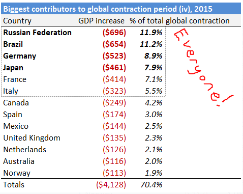
In all, 130 nations saw y-o-y GDP declines in 2015!
Russia, Brazil, Germany, & Japan were together responsible for about 40% of the 2015 Global Apocalypse. Which is not an outsized share, relative to prior contractions. You can see that nobody was responsible for more than 12% of the total decrease in GDP — this contraction was widely distributed.
About 55% of the total decrease in GDP was drive by Europe: Germany, France, Italy, Spain, UK, Netherlands, Norway, and on and on and on.
In fact there was only 1 European nation whose GDP increased at all in 2015. Hint: deep partnerships with the USA tend to be rewarded:

obviously this doesn’t come close to offsetting the collapse that happened everywhere else
The United States economy grew by $700B in 2015, and the Chinese economy grew by $600B, and that’s basically it.
The entire rest of the world ran off a cliff.

And nobody really noticed.
There’s an interesting narrative buried here, from 2010 through to 2015. If all Growth went to the US & China, both of whom completely avoided the economic apocalypse, one imagines that the economic state of the rest of the world looked rather bleak after crashing in 2015.
This is what I meant by Economic Irrelevance:

That’s 8 years of running in place. “In the bleak midwinter…” — y-axis is in Billions of constant-2018 USD
My first published essay discussed the “The Bermuda Triangle of Wealth”, wherein the average American’s savings are consumed by mandatory mid-life purchases priced by suppliers with maximal leverage and full visibility into your “ability to pay”. The price they demand, therefore, is everything you’ve got.
The only escape is to grow faster than the median. Salary, investments, wages, bonuses, stock options, etc. etc. Whatever it takes. If you can grow faster than the average person, you’ll grow your personal Wealth quicker than the costs of these mandatory purchases are being raised.
That’s the only path to individual Wealth.
But the lesson applies at the national level too. Grow faster than the median or cost disease will eat your Wealth.
The first iPhone launched in mid-2007. You think Apple is going to lower prices in foreign markets just because those markets aren’t growing?

reminder: All of Europe’s GDP shrank in 2015 source
Don’t be silly. This chart applies all through your economy, for consumer and industrial goods alike.
Sure, there’s a bottom-tier product that exists to capture the revenue potential of whoever exists at the bottom of the market. But the top-tier product, the new technology, the new release, will continue to be priced under the assumption that those who purchase it are growing.
“Just economize, silly, nobody needs the newest iPhone” — yeah, I agree, I’m still using my 2016 model #pleb. But there’s a huge middle class in Japan and Europe that expects to have a certain purchasing power. A certain economic relevance. They’ve had it for 60+ years in most cases.
One imagines that feeling it slip away is a painful experience.

2016-2018: Locking in the Two-Player Game (Growth)
Global GDP limped back to positive Growth territory in 2016, driven primarily by the rest of the world no longer exploding. But consider that it was only in 2018 that Global GDP reached a new high — 2016 & 2017 might have seen year-over-year growth, but they were still about even with Earth Corp’s productivity numbers from 2014!
“No longer exploding” does not mean “impressive growth”, and the growth inequality in 2018 is as great as ever:

China & the United States account for 45% of Global Growth:

(when including all 181 nations)
Note that this is the exact same share of total growth that Japan & the US captured back in 1996. The difference here is how everyone else’s “share” of the total Growth is distributed:
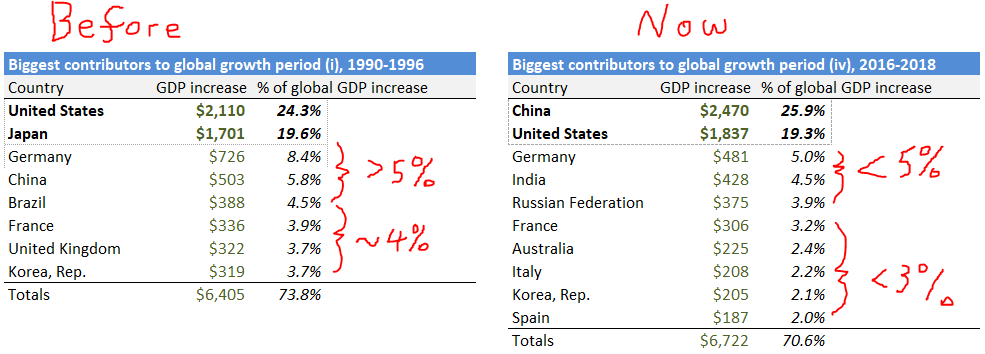
2018 is a 2-player game, with a lot of other players sitting at the table taking 1-2%. 1996 was a 4-player game, with 4 additional players taking 4-10% cuts and everyone else a rounding error.
1996 had greater concentration of Growth in the Top 8 — but 2018 has a greater concentration of Growth in the Top 2.
My points from before about the frustrations of falling below the median Growth hold more true than ever. Germany falls from driving 8% of Global Growth to 5%. France from 4% to 3%. Korea from 4% to 2%. The United Kingdom from 4% to under 2%.
Japan from 20% to 0.5%.
In case the pie chart did not make it obvious, the vast white-space of the Contribution to Global GDP vs. Size chart highlights the degree to which recent growth has been 2-player — but it also restores the correlation between Growth and Scale:
Scale has not correlated this cleanly with Growth since 1996. China has finally caught up — and Japan has finally fallen far enough behind — that the correlation is restored.
Give three cheers for a return to stability.
Conclusion
If United States GDP shrinks by $264B, while German GDP shrinks by $332B, as happened in 2009, both nations are hurting.
And Germany clearly hurts more — $68B more on an absolute basis, and by a greater percentage of its 2008 GDP. That difference widens the gap between the two nations.
But if the United States GDP grows by $2.5 Trillion while German GDP grows by $0.5 Trillion, as happened from 2016-2018, the gap between the productive capacity of the two nations widens by ~$2 Trillion.
Relative to the United States, Germany perhaps performed better in 2009 than 2016-2018.
Rationalists will be quick to point out that this is an unreasonable lens, as rational human actors should rather increase their personal income by $[X] even if their neighbour’s income increases by $[2X], than see their own income decrease by $[Y]. Assuming prices are static, I agree wholeheartedly.
But the lesson of Considerations on Cost Disease, The Bermuda Triangle of Wealth, and The Uncharity of College is that prices for the most important purchases will rise to consume most of the increased Wealth a society generates.
Globalization means the societal reference frame for many prices now becomes [the Most Productive society on Earth].
US GDP growth isn’t going to skyrocket your local rents in Germany (although Chinese GDP growth does appear to impact rents in Vancouver), but some of your favourite consumer goods will be priced according to US growth expectations.
You can grow or not grow, but that new iPhone will cost more regardless.
Those sorts of gaps are hard to track with things like exchange rates, because so many other variables distort currency prices and central bankers & politicians love to get involved. But if you stack trillion-dollar productivity gaps like that up for 25 years, you get:
Citizens, corporations, and governments have the opportunity to capture all that incremental value in the US. Each of those 3 categories is perpetually unhappy with the amount they are actually able to capture…but at least it’s there. Don’t take it for granted.
If you could go back to 1995 and pick one of these two nations to live in under a Rawls-like Veil of Ignorance, all else being equal, the only thing you know is their future Growth…well, I’ll let you make your own choice.
When it comes to Growth, there is a trend of consistent & egalitarian Positive-Sum growth during stable periods. When the “World Order” is solid and the hegemony established, the whole pie tends to grow together. From each according to his ability, to each according to his size.
But periods of instability exist. You cannot describe even recent events without considering the Zero-Sum trades, when new winners emerge from the fray. Those new winners can Create new value and Capture market share from existing players at the same time. And it is these periods that determine the size — the Scale — of nations for the next Growth period.
To only appreciate only one side of the coin is to miss half its value.
Notes
[0] A quick note on data & timing for this one table: European economies experienced a recession from 1999-2000, whereas non-European economies experienced a recession from 2000-2001.
These 2 back-to-back recessions were separated by a matter of months, so I’ve taken the maximum year-over-year decrease in GDP between 1999-2001 for the nations in this table.
It’s a small liberty for the purpose of making this one table clearer. I’m not a fan of these sorts of adjustments and try not to make them.
In this case we had a 2-year period of “meh” Global growth, which was actually created by two back-to-back contractions — first in Europe, and then in Asia.
When measuring the “degree” to which each nation “contributed” to the global recession, I think it’s qualitatively reasonable to consider the maximum Year-over-Year contraction for each individual nation. I promise this is the only adjustment of any kind I made to any of the data here.
Data
I made all the data outputs presented in this essay. I did all the analysis in Excel, because Google Sheets is a pain in the ass for this stuff.
I’m going to import my entire Excel sheet to a Google Sheet here, for anyone who wants to check any of the data or analyze any of it themselves. This will have predictably catastrophic effects on every single chart output, and I’m not much inclined to touch them up. All my data is from the WorldBank’s data repository, which I linked to a few times in the essay, and I think you’ll have an easier time going direct-to-source and pulling your own data. But, for the bold, please feel free to grab the Google Sheet and explore!
Commentary
I’ve written some (long) fun comments discussing this piece on social media, especially the relevance of Per-Capita & Purchasing Power Parity GDP metrics, both of which I tend to eschew. Links to that commentary here:
- Intro: Is the World Greater than the Sum of its Parts
- 1990-1996: The United States of Japan (Growth)
- 1997-1998: China Wins the Industrial War, Upends Existing World Order, Financial Chaos Ensues (Contraction)
- 1999-2001: Unrealized Growth Expectations (Contraction)
- 2002-2008: World Unites, Sings Kumbaya Round Campfire (Growth)
- 2009: If We Go Down, Then We Go Down Together, (Contraction)
- 2010-2014: A Depressing Return to Growth Inequality (Growth)
- 2015: The Global Economic Apocalypse Nobody Remembers (Contraction)
- 2016-2018: Locking in the Two-Player Game (Growth)
- Conclusion
- Notes